Let’s get one thing straight – Power BI isn’t going to replace your data science team. But it can do some surprisingly decent predictive analysis without requiring a PhD in statistics or learning Python. If you need quick forecasts, trend analysis, or “what-if” scenarios for business users, Power BI has you covered.
Here’s how to actually use these features without getting lost in academic theory.
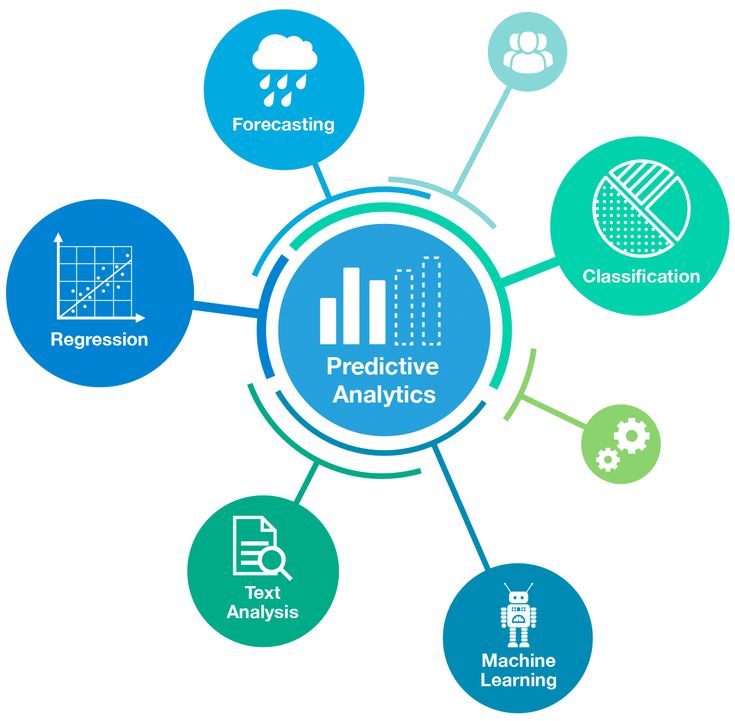
What Power BI Can (and Can’t) Do for Predictions
What it’s good for:
- Sales forecasting based on historical trends
- Quick trend analysis and seasonality detection
- Simple linear predictions
- Anomaly detection in time series data
- What-if parameter scenarios
What it’s not good for:
- Complex machine learning models
- Multivariable regression analysis
- Advanced statistical modeling
- Real-time predictive scoring
Think of Power BI’s predictive features as “business user-friendly” rather than “data scientist grade.”
Built-in Forecasting: The Easy Win
Power BI has forecasting built right into line charts. It’s surprisingly good for basic time-series predictions.
Setting Up Basic Forecasting
- Create a line chart with dates on the X-axis and your metric on the Y-axis
- Click the chart and go to the Analytics pane (looks like a magnifying glass)
- Add Forecast and configure:
- Forecast Length: How far into the future (days, months, etc.)
- Confidence interval: Usually 95% is fine
- Seasonality: Let Power BI auto-detect, or specify if you know (monthly = 12, quarterly = 4)
When Built-in Forecasting Works Well
Good scenarios:
- Regular historical data (at least 2-3 cycles of seasonality)
- Clear trends with some consistency
- Sales data, website traffic, inventory levels
Bad scenarios:
- Highly volatile data with no pattern
- Data with major structural breaks (like COVID impact)
- Less than 6 months of historical data
Real Example: Sales Forecasting
Say you have monthly sales data for 2 years:
- Create line chart: Month (X-axis) vs Sales Amount (Y-axis)
- Add forecast for next 6 months
- Power BI automatically detects yearly seasonality and trend
- You get a forecast line with confidence intervals
Pro tip: The gray shaded area shows confidence intervals. Wider bands = less certainty.
Trend Lines: Simple but Effective
Sometimes you don’t need complex forecasting – just a simple trend line to see direction.
Adding Trend Lines
- Select your chart (line, scatter, or column)
- Analytics pane → Trend line
- Choose trend type:
- Linear: Straight line (most common)
- Exponential: Curved growth
- Logarithmic: Leveling off the curve
- Polynomial: More complex curves
Practical Trend Line Uses
Linear trends for:
- Monthly revenue growth
- Customer acquisition rates
- Cost trends over time
Exponential trends for:
- User growth in the early stages
- Viral adoption patterns
- Compound growth scenarios
Anomaly Detection: Spot the Outliers
Power BI can automatically detect when something unusual happens in your data.
Setting Up Anomaly Detection
- Create a line chart with time series data
- Analytics pane → Find anomalies
- Configure sensitivity:
- High: Catches small deviations
- Medium: Balanced approach
- Low: Only major outliers
What Anomaly Detection Does
It uses statistical methods to identify points that don’t fit the expected pattern based on:
- Historical trends
- Seasonal patterns
- Normal variance ranges
Real example: Daily website traffic with anomaly detection will flag days with unusually high or low traffic, helping you investigate what caused the spike or drop.
Advanced Analytics with R and Python
If you need more sophisticated analysis, Power BI integrates with R and Python scripts.
R Script Visuals
What you can do:
- Advanced statistical models
- Custom forecasting algorithms
- Complex data transformations
- Specialized visualizations
Setup requirements:
- R installed on your machine
- R script visual from the marketplace
Simple R forecasting example:
# Power BI passes your data as a ‘dataset’
library(forecast)
ts_data <- ts(dataset$Sales, frequency=12)
model <- auto.arima(ts_data)
forecast_result <- forecast(model, h=6)
plot(forecast_result)
Python Integration
Popular libraries that work:
- scikit-learn: Machine learning models
- pandas: Data manipulation
- matplotlib/seaborn: Advanced visualizations
- statsmodels: Statistical analysis
Example use case: Customer churn prediction using historical behavior data.
Limitations of Script Visuals
- Performance: Slower than native Power BI features
- Refresh: Scripts run every time data refreshes
- Deployment: Needs R/Python on Power BI Service (Premium only)
- User experience: Not interactive like native visuals
What-If Parameters: Scenario Analysis
This is one of Power BI’s most underrated features for predictive analysis.
Creating What-If Parameters
- Modeling tab → New Parameter
- Configure:
- Name: “Growth Rate” or “Price Increase”
- Data type: Usually a decimal number
- Min/Max values: Reasonable range
- Default: Current or expected value
- Increment: How granular the slider should be
- Use in measures:
Projected Sales =
SUM(Sales[Amount]) * (1 + ‘Growth Rate'[Growth Rate Value])
Real-World Parameter Examples
Sales scenarios:
- Growth rate: -10% to +30%
- Price changes: -20% to +50%
- Market expansion: 0% to 100% increase
Financial modeling:
- Interest rates: 2% to 8%
- Inflation rates: 0% to 10%
- Currency fluctuations: -30% to +30%
Building Scenario Dashboards
Create multiple what-if parameters and combine them:
Scenario Revenue =
VAR BaseRevenue = SUM(Sales[Revenue])
VAR GrowthMultiplier = 1 + ‘Growth Rate'[Growth Rate Value]
VAR PriceMultiplier = 1 + ‘Price Change'[Price Change Value]
RETURN
BaseRevenue * GrowthMultiplier * PriceMultiplier
Users can move sliders to see how different assumptions affect outcomes.
Time Intelligence for Predictions
DAX time intelligence functions are great for creating predictive measures based on historical patterns.
Moving Averages for Smoothing
3 Month Moving Average =
AVERAGEX(
DATESINPERIOD(
Calendar[Date],
MAX(Calendar[Date]),
-3,
MONTH
),
[Total Sales]
)
This smooths out short-term fluctuations to show underlying trends.
Year-over-Year Growth Projection
Projected YoY Growth =
VAR CurrentYearSales = [Total Sales]
VAR LastYearSales = CALCULATE([Total Sales], SAMEPERIODLASTYEAR(Calendar[Date]))
VAR GrowthRate = DIVIDE(CurrentYearSales – LastYearSales, LastYearSales)
RETURN
GrowthRate
Use this growth rate to project future periods.
Seasonal Indexing
Seasonal Index =
VAR MonthAverage = CALCULATE(
AVERAGE(Sales[Amount]),
ALLEXCEPT(Calendar, Calendar[Month])
)
VAR OverallAverage = CALCULATE(
AVERAGE(Sales[Amount]),
ALL(Calendar)
)
RETURN
DIVIDE(MonthAverage, OverallAverage)
This shows which months typically perform above or below average.
External Data for Better Predictions
Power BI can connect to external data sources that improve prediction accuracy.
Economic Indicators
- APIs: Federal Reserve data, stock market indices
- Impact: Correlate business metrics with economic conditions
- Example: Retail sales vs unemployment rates
Weather Data
- Sources: Weather APIs, government datasets
- Use cases: Agriculture, retail, energy consumption
- Example: Ice cream sales vs temperature forecasts
Social Media and Web Analytics
- Google Trends: Search volume for your products
- Social sentiment: Twitter API for brand mentions
- Website traffic: Google Analytics connector
Machine Learning Integration
For more advanced scenarios, you can integrate with Azure Machine Learning.
Azure ML Integration
What you can do:
- Deploy trained ML models
- Real-time scoring in Power BI
- Batch predictions on large datasets
Typical workflow:
- Train the model in Azure ML Studio
- Deploy as a web service
- Connect Power BI to the endpoint
- Score new data in real-time
Custom AI Insights
Power BI Premium includes AI features:
- Automated ML: Build models without coding
- Cognitive Services: Text analysis, image recognition
- AI Insights: Explain increases/decreases automatically
Best Practices for Predictive Analysis
1. Understand Your Data Quality
Check for:
- Missing values and how to handle them
- Outliers that might skew predictions
- Data consistency over time
- Structural breaks in patterns
2. Validate Your Predictions
Always:
- Test predictions against known outcomes
- Use holdout data for validation
- Compare different forecasting methods
- Document assumptions and limitations
3. Communicate Uncertainty
Make it clear:
- Show confidence intervals
- Explain what could make predictions wrong
- Use scenario analysis for different assumptions
- Update forecasts regularly with new data
4. Keep It Simple
Start with:
- Basic trend analysis
- Simple forecasting
- What-if scenarios
- Gradually add complexity as needed
Common Pitfalls and How to Avoid Them
Pitfall 1: Overfitting to Historical Data
Problem: The Model works perfectly on past data but fails on new data.
Solution: Use out-of-sample testing and simpler models
Pitfall 2: Ignoring External Factors
Problem: Predictions based only on internal data miss market changes.
Solution: Include relevant external indicators when possible
Pitfall 3: False Precision
Problem: Showing forecasts to the penny when uncertainty is high.
Solution: Round appropriately and show confidence ranges
Pitfall 4: Static Assumptions
Problem: Using the same parameters regardless of changing conditions
Solution: Regular model updates and dynamic parameters
Quick Implementation Checklist
For basic forecasting:
- [ ] Historical data spans at least 2-3 seasonal cycles
- [ ] Data quality is good (minimal gaps/outliers)
- [ ] The chart shows a clear trend or pattern
- [ ] Forecast length is reasonable (not longer than the historical period)
- [ ] Confidence intervals are displayed and explained
For what-if analysis:
- [ ] Parameters represent realistic business scenarios
- [ ] Value ranges make sense for your industry
- [ ] Multiple scenarios are tested
- [ ] Results are validated against business logic
- [ ] Assumptions are documented
The Reality Check
Power BI’s predictive capabilities are solid for business forecasting but have limits. They work best when:
- You have clean, consistent historical data
- Patterns are relatively stable
- You need quick insights rather than research-grade accuracy
- Business users need to understand and trust the results
For complex predictive modeling, you’ll still need dedicated data science tools. But for 80% of business forecasting needs, Power BI gets the job done without requiring a statistics degree.
The key is knowing when to use these tools and when to call in the data scientists.