When you’re diving into Power BI, one of the first things that can trip you up is understanding when to use a Power BI report versus a dashboard. They might seem similar at first glance, but they serve completely different purposes and have distinct characteristics that make each one suitable for specific scenarios.
What’s a Power BI Report?
Think of a Power BI report as your detailed analysis workspace. It’s where you build your visualizations from scratch, explore your data, and create the foundational elements that tell your data story. Power BI reports are multi-page documents that can contain multiple visuals, and they’re directly connected to your datasets.
Power BI reports are essentially your canvas for data exploration. You can filter, drill down, cross-filter between visuals, and interact with your data in meaningful ways. They’re perfect when you need to provide detailed insights or when stakeholders need to explore data themselves.
What’s a Power BI Dashboard?
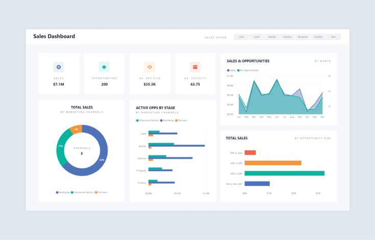
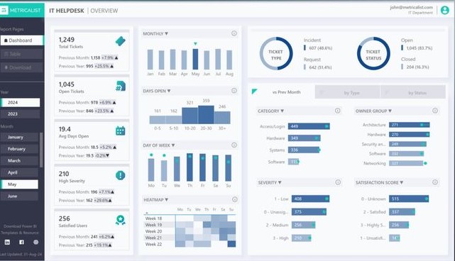
A Power BI dashboard, on the other hand, is more like your executive summary. It’s a single-page view that displays the most important metrics and KPIs at a glance. Power BI dashboards are composed of tiles, and here’s the key difference: these tiles are pinned from existing reports or created using Q&A features.
Dashboards are designed for quick consumption. They’re what you’d display on a wall monitor in your office or check first thing in the morning to get a pulse on your business metrics.
Core Differences at a Glance
| Feature | Power BI Reports | Power BI Dashboards |
| Pages | Multiple pages | Single page only |
| Data Source | Direct dataset connection | Tiles from reports or Q&A |
| Interactivity | Full filtering and cross-filtering | Limited interaction per tile |
| Real-time Updates | Depends on dataset refresh | Can show real-time data |
| Mobile Experience | Responsive design | Optimized mobile layout |
| Sharing | Workspace or app distribution | Easy URL sharing |
| Customization | Full visual customization | Tile arrangement and sizing |
When to Use Power BI Reports
Reports shine when you need detailed analysis capabilities. Use reports when:
Deep data exploration is required. If your users need to filter data by multiple dimensions, drill down into specifics, or explore relationships between different metrics, reports provide the necessary interactivity.
You’re presenting a comprehensive analysis. When you need to tell a complete data story that requires multiple pages or sections, reports give you the structure to organize your narrative logically.
Stakeholders need self-service capabilities. Reports allow users to apply their own filters, change date ranges, and explore data independently without needing to create new content.
You’re working with complex datasets. When dealing with multiple data sources or complex calculations, reports provide the flexibility to build sophisticated visualizations that accurately represent your data relationships.
When to Use Power BI Dashboards
Dashboards are your go-to choice for executive-level monitoring and quick status checks. Choose dashboards when:
You need at-a-glance monitoring. Dashboards excel at displaying key performance indicators that need constant monitoring. Think of sales targets, website traffic, or operational metrics that leadership checks regularly.
Real-time updates are critical. Dashboards can display streaming data and provide real-time updates, making them perfect for operational monitoring scenarios.
Mobile consumption is important. Power BI dashboards are specifically optimized for mobile devices, making them ideal when stakeholders need to check metrics on the go.
You want to highlight key insights from multiple reports. Dashboards let you pull the most important visuals from different reports into one consolidated view.
Technical Considerations
From a development perspective, there are some important technical differences to keep in mind.
Data refresh behavior differs significantly between the two. Reports refresh based on the underlying dataset schedule, while dashboard tiles can have individual refresh schedules. This means you can have some tiles updating every 15 minutes while others refresh daily.
Performance implications also vary. Reports can be resource-intensive since they’re loading entire datasets and allowing complex interactions. Dashboards, since they’re displaying pre-rendered tiles, typically load faster and consume fewer resources.
Security and sharing work differently, too. Reports inherit security from the underlying datasets, while dashboards can be shared more broadly. You can share a dashboard with someone who doesn’t have access to the underlying reports, though they’ll see limited functionality.
Building an Effective Strategy
The most effective Power BI implementations use both reports and dashboards strategically. Start by building comprehensive reports that contain all your detailed analysis and visualizations. These reports serve as your foundation and provide the deep-dive capabilities your analysts need.
Then, create dashboards that pull key metrics from these reports. Pin the most important visuals to dashboards for executive consumption and operational monitoring. This approach gives you the best of both worlds: detailed analysis capabilities and high-level monitoring.
Consider your audience when deciding which format to use. C-level executives typically prefer dashboards for their morning briefings, while analysts and department managers often need the full functionality of reports for their day-to-day work.
Common Pitfalls to Avoid
Don’t try to cram too much information into a dashboard. The power of a dashboard lies in its simplicity and focus on key metrics. If you find yourself needing multiple pages’ worth of information, you probably need a report instead.
Similarly, don’t use reports when a simple dashboard would suffice. If stakeholders only need to monitor a few key metrics and don’t require interactive exploration, a dashboard will provide a better user experience.
Remember that dashboards are consumption-focused while reports are exploration-focused. Design each one with its intended use case in mind, and you’ll create more effective Power BI solutions that actually get used by your stakeholders.
Understanding these differences will help you make better architectural decisions in your Power BI projects and ensure you’re delivering the right type of content for each use case.