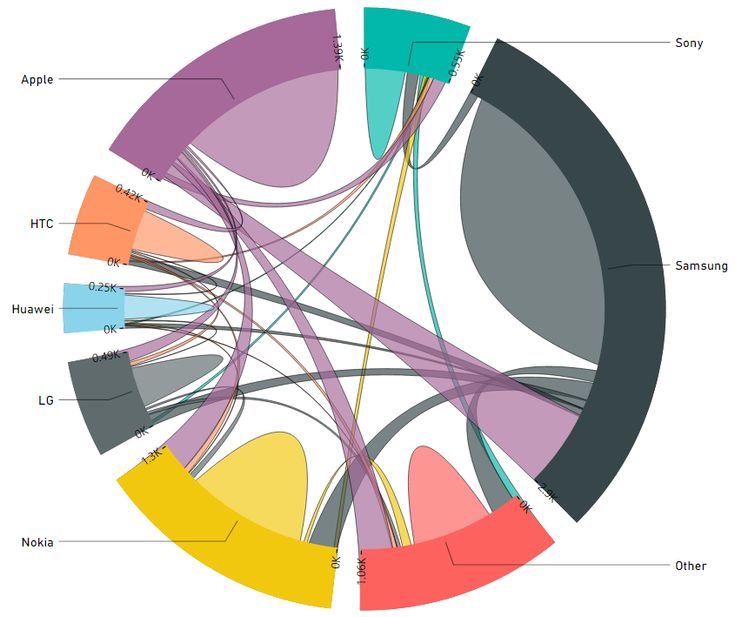
So you’ve been working with Power BI for a while, and you’re hitting those moments where the built-in visuals just don’t cut it. Maybe you need a specific chart type for your industry, or your stakeholders want something that matches your brand perfectly. That’s where custom visuals come in, and honestly, they’re not as scary to build as you might think.

What Are Custom Visuals Anyway?
Custom visuals in Power BI are essentially JavaScript-based components that extend the platform’s visualization capabilities. They’re built using the Power BI Visuals SDK and can do pretty much anything a web-based chart can do. Think D3.js visualizations, custom business charts, or even interactive widgets that go way beyond standard bar and line charts.
The cool part? Once you build them, you can package them up and reuse them across different reports or even share them with the community through Microsoft AppSource.
Setting Up Your Development Environment
Before we dive into code, let’s get your machine ready. You’ll need a few things installed:
Required Tools:

- Node.js (version 14 or higher)
- Power BI Visuals Tools (pbiviz)
- A code editor (VS Code works great)
- Power BI Desktop for testing
First, install the Power BI command line tools:
npm install -g powerbi-visuals-tools
Then create a certificate for local development:
pbiviz-install-cert
This certificate lets Power BI Desktop trust your custom visuals during development. You’ll need to restart Power BI Desktop after installing it.
Creating Your First Custom Visual
Let’s build something simple but useful: a custom gauge chart. Start by creating a new visual project:
pbiviz new customGauge
cd customGauge
This creates a project structure that looks like this:
customGauge/
├── .vscode/
├── assets/
├── src/
│ ├── settings.ts
│ └── visual.ts
├── style/
├── capabilities.json
├── package.json
└── pbiviz.json
The main files you’ll work with:
- visual.ts—Your main visual logic
- capabilities.json—Defines what data your visual accepts
- pbiviz.json—Visual metadata and configuration
Understanding the Visual Lifecycle
Every Power BI custom visual follows the same basic lifecycle:
- Constructor—Initialize your visual
- Update – Handle data changes and re-render
- Destroy—Clean up when visual is removed
Here’s the basic structure in visual.ts:
export class Visual implements IVisual {
private target: HTMLElement;
private host: IVisualHost;
constructor(options: VisualConstructorOptions) {
this.target = options.element;
this.host = options.host;
// Initialize your visual here
}
public update(options: VisualUpdateOptions) {
// Handle data updates and re-render
const dataView = options.dataViews[0];
if (!dataView) return;
// Your rendering logic goes here
}
public destroy(): void {
// Clean up resources
}
}
Configuring Data Binding
Power BI is informed by the JSON file about what type of data your visualization requires. We would like one measured value and possibly a target value for our gauge:
{
“dataRoles”: [
{
“displayName”: “Value”,
“name”: “measure”,
“kind”: “Measure”
},
{
“displayName”: “Target”,
“name”: “target”,
“kind”: “Measure”
}
],
“dataViewMappings”: [
{
“categorical”: {
“values”: {
“select”: [
{ “bind”: { “to”: “measure” } },
{ “bind”: { “to”: “target” } }
]
}
}
}
]
}
Building the Gauge Visual
Now for the fun part: actually creating the visual. We’ll use D3.js since it’s powerful and well-supported:
import * as d3 from “d3”;
export class Visual implements IVisual {
private svg: d3.Selection<SVGElement, any, any, any>;
private container: d3.Selection<SVGElement, any, any, any>;
constructor(options: VisualConstructorOptions) {
this.svg = d3.select(options.element)
.append(‘svg’)
.classed(‘gauge’, true);
this.container = this.svg.append(“g”)
.classed(‘container’, true);
}
public update(options: VisualUpdateOptions) {
const dataView = options.dataViews[0];
const width = options.viewport.width;
const height = options.viewport.height;
this.svg
.attr(“width”, width)
.attr(“height”, height);
if (dataView?.categorical?.values) {
const value = dataView.categorical.values[0].values[0] as number;
const target = dataView.categorical.values[1]?.values[0] as number || 100;
this.renderGauge(width, height, value, target);
}
}
private renderGauge(width: number, height: number, value: number, target: number) {
// Clear previous content
this.container.selectAll(“*”).remove();
const radius = Math.min(width, height) / 2 – 10;
const centerX = width / 2;
const centerY = height / 2;
this.container.attr(“transform”, `translate(${centerX}, ${centerY})`);
// Create gauge background arc
const backgroundArc = d3.arc()
.innerRadius(radius – 20)
.outerRadius(radius)
.startAngle(-Math.PI / 2)
.endAngle(Math.PI / 2);
this.container.append(“path”)
.datum({})
.attr(“class”, “gauge-background”)
.attr(“d”, backgroundArc)
.attr(“fill”, “#e0e0e0”);
// Create value arc
const percentage = Math.min(value / target, 1);
const valueArc = d3.arc()
.innerRadius(radius – 20)
.outerRadius(radius)
.startAngle(-Math.PI / 2)
.endAngle(-Math.PI / 2 + Math.PI * percentage);
this.container.append(“path”)
.datum({})
.attr(“class”, “gauge-value”)
.attr(“d”, valueArc)
.attr(“fill”, this.getColor(percentage));
// Add text label
this.container.append(“text”)
.attr(“text-anchor”, “middle”)
.attr(“dy”, “0.35em”)
.attr(“font-size”, “24px”)
.text(`${Math.round(percentage * 100)}%`);
}
private getColor(percentage: number): string {
if (percentage < 0.5) return “#ff4444”;
if (percentage < 0.8) return “#ffaa00”;
return “#44ff44”;
}
}
Testing Your Visual
To test your visual locally:
pbiviz start
This starts a development server. In Power BI Desktop, you’ll see a “Developer Visual” option in the visualizations pane. Drag it onto your canvas, and it’ll load your custom visual in real-time.
Pro tip: Keep the browser developer tools open (F12) while testing. Any console errors from your visual will show up there, which is super helpful for debugging.
Adding Custom Properties
You’ll probably want users to customize your visual. Add formatting options in the capabilities.json:
“objects”: {
“gauge”: {
“displayName”: “Gauge Settings”,
“properties”: {
“minValue”: {
“displayName”: “Minimum Value”,
“type”: { “numeric”: true }
},
“maxValue”: {
“displayName”: “Maximum Value”,
“type”: { “numeric”: true }
},
“fillColor”: {
“displayName”: “Fill Color”,
“type”: { “fill”: { “solid”: { “color”: true } } }
}
}
}
}
Then read these properties in your visual:
private getSettings(dataView: DataView): any {
return {
minValue: dataView.metadata?.objects?.gauge?.minValue || 0,
maxValue: dataView.metadata?.objects?.gauge?.maxValue || 100,
fillColor: dataView.metadata?.objects?.gauge?.fillColor || “#1f77b4”
};
}
Packaging and Distribution
When you’re happy with your visual, package it up:
pbiviz package
This creates a .pbiviz file in the dist folder. You can:
- Import it directly into Power BI Desktop
- Upload it to your Power BI tenant
- Submit it to Microsoft AppSource for public distribution
Common Gotchas and Tips
Performance matters: Power BI can handle large datasets. Always consider performance, especially with D3.js animations. Debounce updates and avoid creating DOM elements unnecessarily.
Responsive design: Your visual needs to work at different sizes. Test it on small and large users; it will resize.
Handle missing data gracefully: Always check if your data exists before trying to render. Users will drag fields around, and your visual shouldn’t crash.
Use TypeScript properly: The SDK is built for TypeScript. Use proper typing; it’ll save you debugging time later.
Test with real data: Lorem ipsum is fine for initial development, but test with actual messy business data as soon as possible.
Next Steps
This gauge is just the beginning. Custom visuals can integrate with external APIs, include complex interactions, or even embed other web technologies. The Power BI Visuals SDK documentation has tons of examples, and the community gallery is full of inspiration.
The key is starting simple and iterating. Build something basic that works, then add complexity. Your stakeholders will be impressed that you built something specifically for their needs, and you’ll have learned a skill that makes you way more valuable as a Power BI developer.
Want to take it further? Look into adding drill-down capabilities, cross-filtering with other visuals, or even integrating with external charting libraries like Chart.js or Plotly. The possibilities are pretty much endless once you get the hang of it.