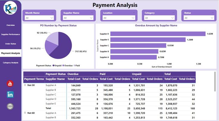
If you’ve ever built a Power BI dashboard and wanted your users to interact with it (instead of just staring at static charts), slicers and filters are your best friends. They’re the difference between a boring report and an interactive experience that lets users dig into the data themselves.
Let’s dive into how to use these tools effectively without overcomplicating things.
What’s the Difference Between Power BI Slicers and Power BI Filters?
Before we jump into the how-to, let’s clear up the confusion. I see people mixing these up all the time:
Power BI slicers are the visual elements your users see and interact with on the dashboard—those dropdown menus, buttons, and date pickers sitting right on your report canvas.
Power BI filters work behind the scenes in the Filters pane. They can be page-level, report-level, or visual-level, and users might not even see them depending on how you set things up.
Think of slicers as the steering wheel users see, and filters as the engine components they don’t need to worry about.
Setting Up Basic Power BI Slicers
1. Creating a Simple Slicer
This is straightforward, but let me walk through it:
- Go to the Visualizations pane and click the slicer icon (looks like a funnel)
- Drag your field into the “Field” well
- Boom—you’ve got a basic slicer
Pro tip: Don’t just dump every column into a slicer. Ask yourself, “Will users want to filter by this?” If the answer is maybe, probably skip it.
2. Power BI Slicer Types That Work
Here are the slicer formats I use most often:
| Slicer Type | Best For | When to Avoid |
| List | Categories with 3-15 items | Long lists (over 20 items) |
| Dropdown | Space-constrained dashboards | When you want multiple selections visible |
| When you want multiple selections to be visible | Date ranges, numeric ranges | Single date selection |
| Before/After | Relative date filtering | Precise date ranges |
| Relative Date | “Last 30 days” type scenarios | Historical analysis |
3. Date Slicers Done Right
Date slicers are probably the most used (and most screwed up) slicers out there. Here’s how to do them properly:
For date ranges, use the “Between” style:
- Users can select start and end dates
- Much cleaner than showing every single date
- Less overwhelming for users
For relative dates, use the “Relative Date” slicer:
- “Last 7 days,” “This month,” “Year to date”
- Perfect for operational dashboards
- Updates automatically
Quick setup: Drag your date field to a slicer, then in the Format pane:
– Style: Between (for ranges) or Relative Date (for periods)
– Show “Select All”: Usually turn this OFF
– Single Select: ON if you want only one choice at a time
Advanced Power BI Slicer Techniques
Cross-Filtering Magic
Here’s something that trips people up: slicers affect ALL visuals on a page by default. But you can control this:
To make a slicer NOT affect a specific visual:
- Select the visual you want to exclude
- Go to Format > Edit interactions (it’s in the ribbon)
- Click the slicer, then click the “None” option above your visual
This is super useful when you have summary cards that should show totals regardless of filters.
Sync Slicers Across Pages
If you have multiple pages and want the same filter to work across all of them:
- Select your slicer
- Go to View > Sync slicers
- Check the pages where you want it to appear
- Choose whether it’s visible or just synced on each page
Real-world example: I often put a date range slicer on the first page (visible) and sync it to other pages (hidden). Users set their date range once, and it applies everywhere.
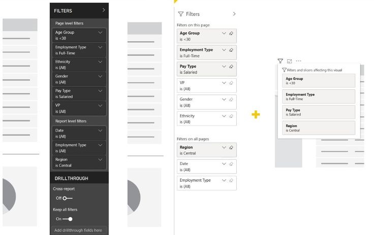
Power BI Filter Pane Strategies
The Power BI Filters pane is where you set up the behind-the-scenes filtering logic. Here’s how I typically structure it:
Page-Level Filters
Use these for filters that should affect everything on the current page but not other pages. Perfect for:
- Department-specific pages
- Regional dashboards
- Time period constraints
Report-Level Filters
These affect your entire report. I use them sparingly, usually for:
- Security (filtering data by user permissions)
- Data quality (excluding test records)
- Major business segments
Visual-Level Filters
Applied directly to individual charts. Great for:
- Top N filters (show only the top 10 customers)
- Threshold filters (sales > $1000)
- Specific conditions for that visual only
Performance Tips That Matter
Power BI slicers can slow down your reports if you’re not careful. Here are the fixes that make a real difference:
1. Reduce Cardinality
Don’t create slicers on fields with thousands of unique values. If you must, consider grouping or categorizing first.
2. Use Measures for Dynamic Filtering
Instead of filtering on raw data, create measures that handle the logic:
Filtered Sales =
CALCULATE(
SUM(Sales[Amount]),
Sales[Status] = “Active”
)
3. Optimize Your Data Model
- Use proper relationships instead of relying on cross-filtering
- Keep dimension tables small
- Use a star schema where possible
Common Mistakes (And How to Fix Them)
Mistake 1: Too Many Slicers
I’ve seen dashboards with 15+ slicers. That’s not interactive—that’s overwhelming.
Fix: Limit to 3-5 slicers per page. Use hierarchical filtering (country → state → city) instead of separate slicers for each level.
Mistake 2: Unclear Slicer Labels
“Dim_Product_Category_Key” is not a user-friendly slicer name.
Fix: Right-click the field and rename it to something humans understand, like “Product Category”.
Mistake 3: No Default State
Users shouldn’t land on a blank dashboard because no filters are selected.
Fix: Set default selections or use measures that show meaningful data even with no filters applied.
Quick Implementation Checklist
When adding slicers to your dashboard, run through this:
- [ ] Does this slicer serve a clear purpose?
- [ ] Is the default state useful?
- [ ] Are the labels clear and user-friendly?
- [ ] Does it work well on mobile?
- [ ] Is the performance acceptable?
- [ ] Have you tested all combinations?
Wrapping Up
Slicers and filters are what transform your Power BI reports from static presentations into interactive tools people want to use. The key is finding the right balance—enough interactivity to be useful, but not so much that users get lost.
Start simple, test with real users, and iterate based on feedback. Your dashboards will be much better for it.
Remember: the best slicer is often the one you decide NOT to add. Keep it focused, keep it fast, and keep it user-friendly.